How to design album cover graphics?
Today we are going to talk about the process of creating album graphics in Affinity Designer for iPad. We are going to talk briefly about the software and then do the walkthrough on creating the cover. I will be taking you from the concept idea, through the image / photo selection and processing to the importance of triangles and the final polish before we are done.
I am warming up my design skills after the vacation today. We have had the hottest summer ever in Sweden which is both wonderful and troublesome. Didn’t see that one coming our way in the cold north. The heat has worn off and so it’s time to boot up that Mac and get back to the reality of fun work in the fresh autumn breeze.
What is Affinity Designer
Before we dig in to the production of a product cover let’s just first discuss what kind of app Serif developed in Affinity Designer.
If you are unfamiliar with the app I would say that it is a superb vector and pixel application for designers. The app draws inspiration from the famous desktop programs Photoshop and Illustrator. It combines the two into one solid package and also goes beyond when it comes to usability, stability and modern features. Oh, and that sleek modern design and color scheme of Affinity just make you design better things. Hrm, well I wish! 🙂
I’ve been working with Affinity Designer desktop version for many years on multiple client design projects for the webb, print and mobile apps. So I was pretty eager to try out the iPad version.
Can we really let go of our precious Illustrator?
Yes, indeed!
Artboards – excellent layout overview
One great feature of Affinity is that you have something called artboards which could be described as separate documents within a document. You can easily setup each page of a product folder or each page of a business card as a separate artboard.
The artboards give you a very good overview and can separate parts of your design layouts very easily.
![]()
The three main workspaces of Affinity Designer
Affinity Designer is split into three major workspaces: Draw Persona, Pixel Persona and the Export Persona. In the Draw Persona you create and manipulate vector shapes, in the Pixel Persona pixel graphics and finally in the Export Persona you adjust how you want your final images output.
If you ever created icon graphics for applications you know how cumbersome it can be to create all the different icon sizes. Or setup batch scripts / macros that create the different sizes for us.
One minor adjustment to your icon and you have to do several steps to render out new icons.
Fear no more!
Image export that just makes you smile…bigtime!
With Affinity Designer the image export is a breeze in the Export Persona. There you define which areas of your artboards to export. It’s like a super macro batch exporter where you also set file formats and target resolution. Export a press ready PDF/X-4, a fully layered PSD, SVG or EPS file.
There are tons of great presets for the exporter and note that you can define multiple export files for a single image. It’s just the best export function I have ever seen in a application. Definitely a big leap for modern graphic apps.
A great mobile solution for designers
These excellent functions would be so great to be able to have on a mobile device like the iPad Pro.
And now we haven’t even touched the easy and straight forward vector editing functions of Affinity Designer which we will cover later in this post. So the desktop app have been around a few years and some years back I bought the iPad Pro with the Apple Pencil to research if I could transition some of the design work to a more mobile solution.
Serif posted that they had started the development of Affinity Designer for iPad but it was in a early closed beta and development focus seemed to be on the photographic oriented app, Affinity Photo.

Then we have the price question:
Everyone (your old favourite graphic software) is going subscription based payment model. It’s kind of sad since you might have already payed for the software previously.
I understand the importance of regular income if you are running a product development company since I’ve been developing quite a few products myself.
Most recently a bunch of iOS and Android apps for the family audience with Morningdew Media. You need a constant cashflow from the product in order to make all the necessary updates to keep the audience happy. And get those important 5 star ratings (or was it rantings?).
I was very glad to see that Affinity offers the app for a one time fee of £19.99 (209 SEK) which is a bargain if you look at the quality you get.
And now for the ultimate of questions:
Is it possible to go all in mobile with designing vector graphics and product layouts?
When Affinity Designer finally was released I instantly got my hands on it to see if Serif could translate the app to the touch environment of the iPad. I wanted to see if I could actually do some serious vector and design work on the iPad rather than the desktop app. The iPad Pro has quite some power, let’s see if we get the chance to play with all that power?
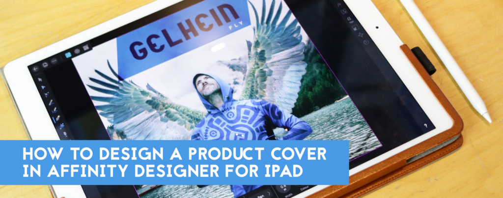
How to design album cover graphics in Affinity Designer for iPad
Ok, so now we have some background on the software we will be using. Let’s discuss the design workflow and how we design album cover graphics for the single – Fly.
The story behind the album cover – Fly
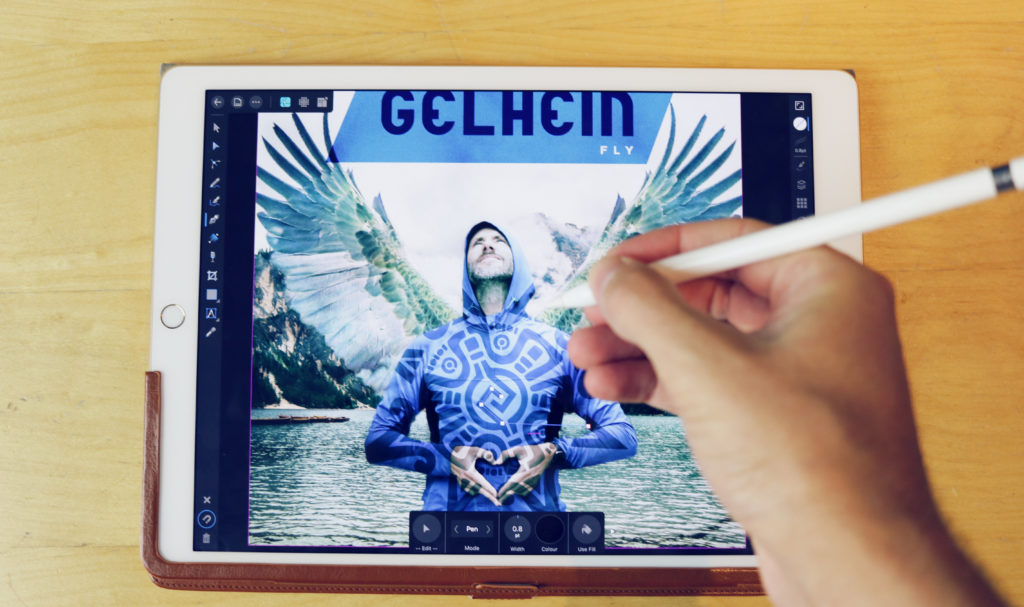
I’ve composed a new single song called – Fly. It will be released very soon under the artist name Gelhein. The music is a mixture of future bass and chill out electro. Fly is a uplifting track featuring a new vocalist I just started working with. I am currently wrapping up the final pieces before it’s release so why not do the album cover graphics as the first real sharp project in Affinity Designer for iPad.
Selecting a design direction and color scheme for the album cover
The song is about trying new things in life and to step out of your comfortzone. Keep the faith and to not be afraid of failing. The music is a mixture of chill out, future bass and pop with a banging and uplifting chorus. I’m a big fan of the uplifting future bass genre featuring artists like Said the sky, Illenium, Seven Lions etc.
So how do we start? Where do we go from nothing to something?
Let’s first come up with a few keywords (not Adwords keywords). But rather keywords that define our product, the song in this case. I always make some quick notes of the key ingredients that I come up with before I start the actual design of the cover graphics.
The key ingredients should not be overwhelming or hard to grasp, remember the key here is that simple is better. If you choose too many keys you probably have…too many keys. Thus the title Keeper of the seven keys (Helloween *hint hint*).
Sorry I got carried away, I know, once a rocker always a rocker.
…the key here is that simple is better.
So my keywords quickly materialised in:
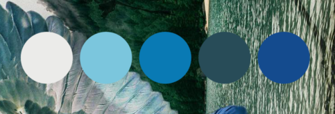
- Blue & light green colors – inspiration from mediterranean beaches and earth colors, slightly washed out
- Heart – since it’s about keeping faith
- Wings – since the title is fly, obviously. =)
- Clouds
- High Mountains – as a background
- Flying eagles, angles, deamons (nah… this is for uplifting future bass music, not a metal record)
In what direction do we take the keywords?
Let’s stop there and just take a quick summary of what we got.
A cloudy mountain scenery backdrop with a character flying (or wanting to fly) in the foreground. But how do we get the heart of love and faith into this. Since I already mentally selected a mountain background as the backdrop maybe we could start thinking about symbols or signs instead. Thus I came up with the idea of the person making a heart sign with the hands.
We don’t want too many images within the image or things will start to get too complicated. Remember, simplicity is the key.
The cover will be much easier to read if we keep things simple.
The cover will be much easier to read if we keep things simple. There are of course great covers with plenty of details too, but I found it more relevant today to keep things less cluttered.
Some early ideas of a strong flying eagle in the background was excluded, and replaced with the idea of putting wings to the character in the foreground instead.
After the cover image was composited I would color correct and make adjustments to make the overall tone of the image blue and ocean green.
Although I kept the colors in mind while doing all the parts to keep myself within the color range.
Finding a great background to set the tone of the album cover graphics
I have a large batch of nice photos taken from all over the world but sometimes it’s faster to find a great stock photo online. There are plenty of great free stock photos on the web, if you have the eyes to know what you are looking for.
And if you have done your keyword homework…right?
There are plenty of ugly and dull photos too, if you are not comfortable selecting images, hire a professional designer.
Do not to forget the copyright license format of the images you select, make sure that they are free for personal and commercial use. Important!
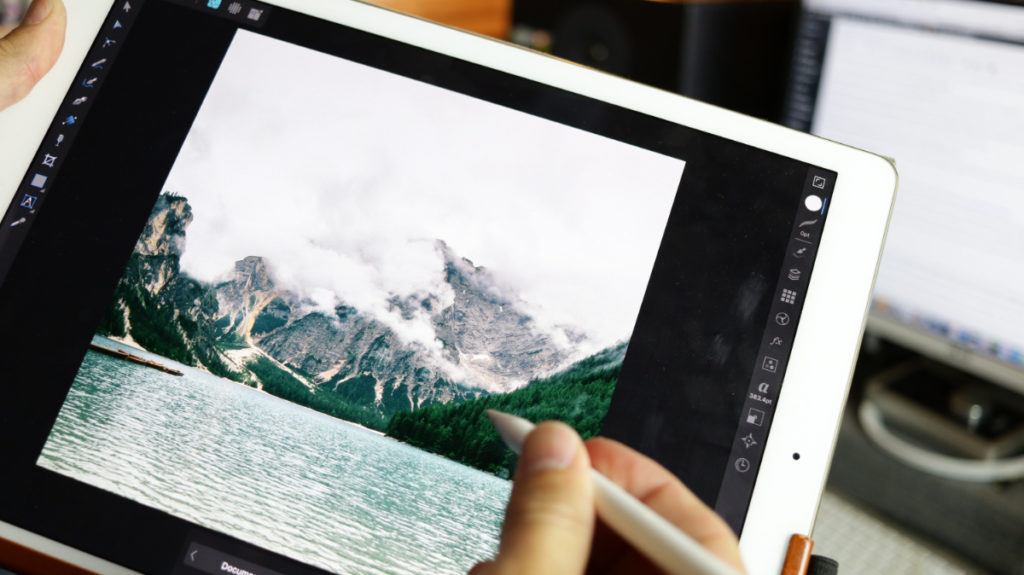
I found the nice backdrop from the website – Pexels since I knew exactly what I was looking for. In this case a mountain rising from the sea with some mist or clouds above.
I tried playing around with some additional layers of clouds on top of the mountain but, but I felt I had to step back and let the photo breath. Again, simplicity won!
Designing the flying character in blue
I did a quick search in my photo library and on a few stock sites but didn’t find a suitable character to fit the album cover. I thought about painting the character to get the heart sign included but that would take the cover into a completely different direction. With the mountain photo we selected earlier we established a photographic realistic cover design.
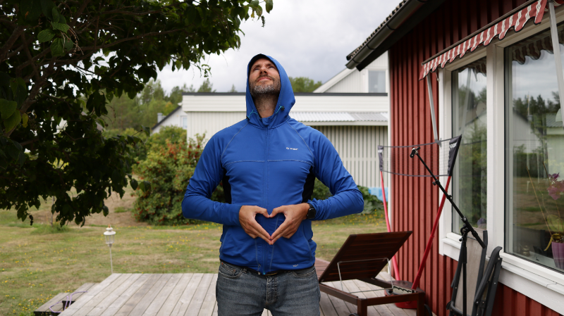
So one option was to take a photo myself. In the back of my mind I remembered a blue training jacket that was hanging in the wardrobe. This would be a great match for the album cover graphics color scheme.
I knew it’s very easy to mask out objects with Affinity Designer so I was not that bothered with the background of the photo as you can see. I could match the light of the scene from the mountain photo by taking the character photo on a cloudy but not too murky day.
Always make sure to match the light as much as you can if you are merging images from different scenes.
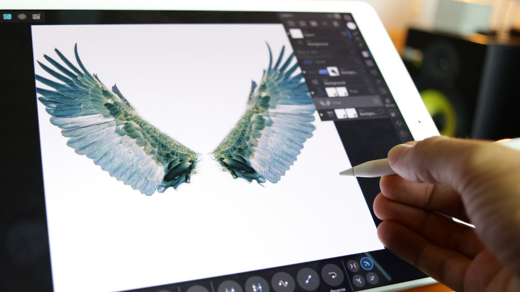
I also found a great closeup photo of an eagle spreading it’s wings. It was a breeze masking and cutting out one of the wings with the selection tool.
After selecting your object you can refine the selection with some nifty tools that Affinity offer to make the selection even better. And it’s very accurate and fast to work with!
Making the images work together
And so it was time to merge the images and put things together in Affinity Designer.
I created a new project file with the size 3000 x 3000 pixels which would be enough for the target platforms of Spotify, Bandcamp, iTunes etc.
Then I imported the mountain, eagle wings, logo and character into the project. Selected a cropping size for the mountain where I felt there would be enough space for a logo on the top. The character was placed in the center and the wings resized and rotated to look good and embrace the logo on the top.
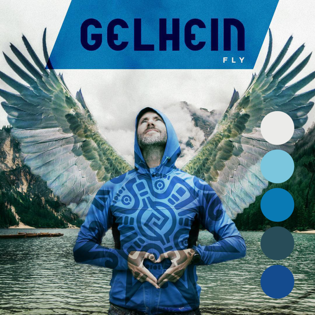
To all images I added a adjustment layer with the color curves to adjust and ever so slightly pull all colors towards the right color scheme I had defined.
It’s almost like glue, when you do these subtle or mild changes you feel that the scene comes together.
Creating vector shapes in the Draw Persona
In the Draw Persona I created a vector sigill with some basic symbols and markings. The sigill was put on a multiply layer above the character which would enhance the zen like (or alien) state of the piece. The tilted (or shared) blue rectangle on the top beneath the logo was added as a “breaker” to give the image a little bit of odd angles, I’m a big fan of triangles in designs. Ever played The Legend Of Zelda, maybe Breath of the wild in particular where they went bananas with the triangle theme.
Add triangles to your designs to make them more interesting.
After that it was only a matter of adding some grit and a small amount of color filter to the image to make it glue even more. It’s almost like using a compressor or mastering device on a song. You make the piece feel complete and finished.
On top of it all with very low opacity setting I created a vector box with a light color and added a ton of grain. There’s a slider where you can control how much grain you want to add to all surfaces / faces of your vector shapes. It’s very useful to get some movement and life into the sterile world of digital art.
Nothing is perfect!
Exporting the finished album cover graphic
After that I felt the image was complete and clicked the Export Persona and exported the image as a png and also as a smaller jpg for lighter emails etc.
Case closed!
I hope you found this design case interesting, and that you can take something with you from the ideas I presented. If you have any questions or design requests please do get in touch.
Thanks for reading, and have a splendid weekend!
Cheers,
Mattias Holmgren / Creative Director
About the author:
Mattias Holmgren is a creative director sailing from Sweden. He runs Morningdew Media and works as a freelancer for various creative design, app, music and sound design projects. He has lectured in both music production and app publishing & marketing. Became fluent in programming in the young teens. Developed small game projects on various computers in different languages, then went to music & design school. Released a bunch of albums with a bunch of metal bands. Graduating from bands to composition then production, he relishes the chance to play anything that makes noise. The past years Mattias has developed and released a floura of apps for the kids and family market, apps like; Nisse Playful (Lek och lär med Nisse), Playful Math, Nisses Music and Luminati. On YouTube you can find multiple technical tutorials from Mattias where he teaches and spreads love around design, art and music.
About this post
I use affiliate links on my website, but my opinion isn’t for sale. Therefore, I only recommend what I use, have used or vetted in the best interest of my readers. While I may earn a commission if you click on an affiliate link, it won’t cost you extra. Finally, I hope you like my recommendations. Feel free to contact me if you have questions regarding some of the gear I use!
What gear I use in the studio? Check out the Resources Page.
Join my exclusive community: https://www.patreon.com/gelhein
Be sure to sign up to our newsletter for new exciting articles in design, music production and sound design.


 presets")